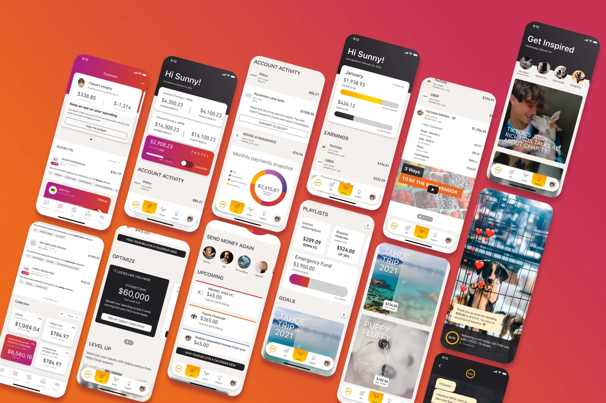
Wells Fargo undertook a bold initiative: a complete overhaul of the money-moving process for customers and a reimagining of their mobile app. With a substantial user base of 27 million active customers, the goal was to not only redesign but also reposition the app within the market. I played a pivotal role as the Lead Designer within a talented team that included a UX Architect, two designers, a researcher, and a Product Manager. Our collective mission was to shape an innovative and user-centric mobile experience that aligned seamlessly with Wells Fargo's vision and customer expectations.
Upon joining Wells Fargo, our team encountered a few challenges that required our attention. Specifically, there were four key challenges that I took a leading role in addressing and resolving.
In alignment with our leadership's strategic focus on optimizing cross-selling across our customers' journey, our team delved into the concept of creating curated playlists or collections. These collections not only served as a means of aiding customers in their future planning endeavors but also provided a convenient hub for quick access to their various lists and goals.
Taking cues from one of Wells Fargo's distinctive Credit Cards, I embarked on the creation of a color palette that not only encapsulated the essence of the brand but also synergized seamlessly with the design. By thoughtfully incorporating the card's hues, I aimed to evoke a sense of familiarity and trust among users. This approach to design not only addressed the need for functional enhancement but also played a pivotal role in reinforcing the app's alignment with Wells Fargo's branding aspirations.
Drawing from the existing app features and our envisioned improvements, I crafted a straightforward design that seamlessly bridged the gap between the current state and the desired future of the application.
Additionally, we introduced an innovative concept to enhance our mobile app - Collections. This feature aimed to provide our customers with a convenient means to efficiently gather and save specific transactions, simplifying tracking and management.
The concept was met with great enthusiasm by senior leadership and has been slated for incorporation into future iterations of the mobile app. This addition promises to further elevate the user experience, aligning with our commitment to empowering our customers in managing their finances seamlessly.
The second challenge revolved around reimagining the app's role in assisting customers to enhance their financial goals. Drawing insights from informal research with a younger demographic, our team swiftly designed a vision for this new experience. We recognized that customers sought avenues to not only grow their funds but also leverage their money to complement their supplementary income streams. The gig economy emerged as a pivotal focus area, prompting us to design an app tailored to amplify users' financial potential, broaden their banking horizons, and inspire them to explore investment opportunities and other financial avenues. Every segment of the app had distinct requirements and functionalities we aimed to delve into.
Taking the lead, I promptly embarked on crafting the look and feel for this innovative design concept based on Wells Fargo branding and experimentations.
The "DO" section prioritized providing customers with a seamless experience for their everyday banking needs, encompassing checking, savings, and other associated accounts. Additionally, we looked to incorporate swift actions that guided users on potential actions aligned with specific account transactions, streamlining their interaction with the app and promoting specific banking features, like Zelle™, Credit Cards, etc..
Within the "Grow" category, our primary objective was to empower customers to monitor their financial resources' allocation and explore avenues to enhance their wealth in alignment with their objectives. The emphasis here was on creating a visually engaging experience for customers. Utilizing a visual approach in the goals section allows customers to emotionally connect with their financial objectives. As progress is made, the gradual unveiling of intended goals fosters motivation and commitment, providing a tangible representation of their financial journey. In addition, our goal was to provide customers with tailored opportunities for financial education, utilizing transaction-specific triggers to surface relevant videos and articles that would guide them in making informed financial decisions.
The "Inspire" category aimed to offer customers a space beyond their routine banking activities, encouraging exploration of opportunities to utilize their funds for greater impact. This section was designed as an engaging experience, featuring short-form video content from diverse sources. Tailored to a younger audience, the format resembled the popular video consumption patterns found in platforms, aligning with their preferences.
The culmination of these challenges resulted in resounding success for our group and division. We effectively communicated our approach, rooted in comprehensive research and outcomes, which underscored the rationale behind our designs.
I played a crucial role in prototyping our visionary concepts and presenting them to our stakeholders for valuable feedback. Although I'm not currently aware to the team's ongoing work with these designs, the journey was undeniably awesome. It afforded us the opportunity to prioritize the customer's perspective and collectively envision a future user experience that was not only functional but also aesthetically appealing.
To truly comprehend our customers' needs and synchronize them with their desired outcomes, alignment with business objectives was paramount. Our journey began by delving deep into what held genuine significance for our customers and identifying areas where we could make a difference. Leveraging a widely adopted UX approach, we engaged in an extensive exploration of our customers' preferences. Employing journey maps, we meticulously charted out the flow of interactions and pinpointed pain points our customers encountered while navigating the then current mobile app. This strategic approach allowed us to gain profound insights into our customers' experiences and challenges.
Our approach involved mapping out the customer journey with a keen focus on outcomes and pivotal moments. This deliberate strategy served a dual purpose: it allowed us to craft a compelling narrative for our stakeholders, providing them with a clear understanding of the features that warranted attention and the potential business value they could unlock. However, the most invaluable outcome of this approach was gaining a deep understanding of our customers, tuning in closely to their needs and aspirations. By empathetically listening intently to their needs and desires, we were better equipped to shape solutions that truly resonated with them.
We elaborated in a meticulous examination of the feedback from customers, adopting a "Jobs to Be Done" approach. This method was instrumental in delving deeper into the emotional dimensions of their desired outcomes.
Our aim was to approach these outcomes from a place of empathy, ensuring that we didn't just address functional needs, but also connected with the underlying feelings and aspirations of our customers. This empathetic lens was pivotal in realizing our vision of an outcomes-focused approach.
Following this, we transitioned into the storyboarding phase. Here, our objective was to narrate the experiences of our customers as they navigated their daily lives, handling their finances and anticipating future challenges. We aimed to craft a visual narrative that was not only descriptive but also empathetic, allowing us to truly capture and convey their stories. This visual storytelling process played a crucial role in building a deeper understanding of our customers and the real-world scenarios they encountered. We created a specific storyboard for each outcome, mapping out moments that resonated with our objectives for both customers and businesses. This method helped us align priorities with stakeholders, developers, and designers on where to focus our efforts.
We crafted individual storyboards for each outcome, delineating key moments that resonated with our goals for both customers and businesses. This approach facilitated alignment of priorities among stakeholders, developers, and designers, enabling us to focus our efforts effectively. It also assisted us in setting clear priorities for both short-term and long-term objectives, ensuring that all parties were on the same page.
While my work may not have been fully implemented by the company, I am confident that it has left an memorable mark on the potential direction Wells Fargo could pursue in future iterations. Collaborating with an exceptional team, I not only acquired valuable insights but also made significant contributions to an enriching experience with Wells Fargo.
Boris has the spirit and ability to bring people together to understand and solve the user's needs in very humanistic terms. He is a highly skilled product designer and is able to translate those complex needs into thoughtful and innovative design solutions. In addition to his strong technical skills he's a joy to work with, and is always eager to help others. I've always looked up to him as a mentor and I've learned so much from his guidance and support.